31Food watercolor ideas&contrast and brightness of colors, come to see my tips
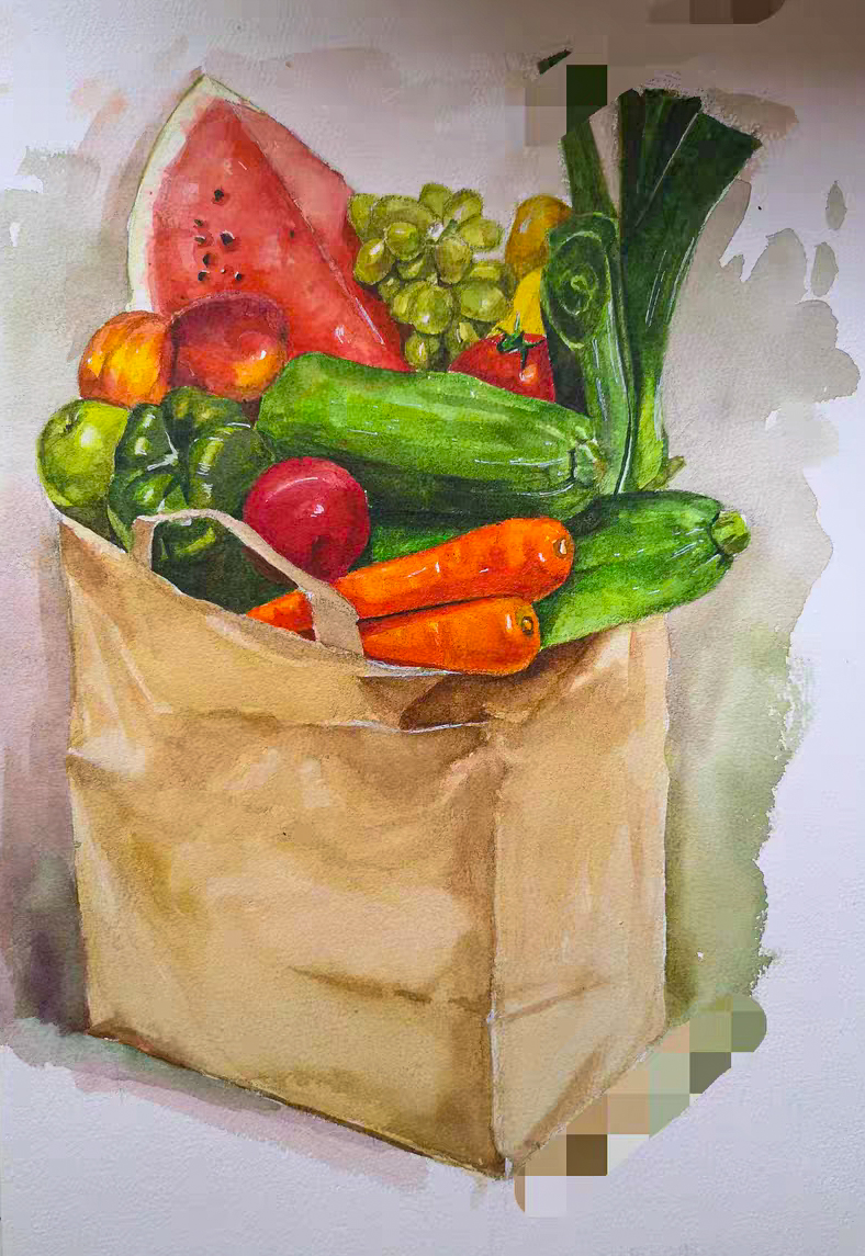
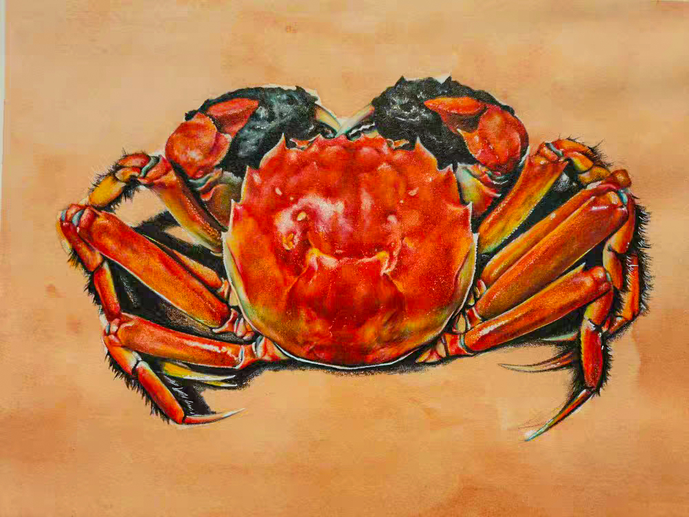
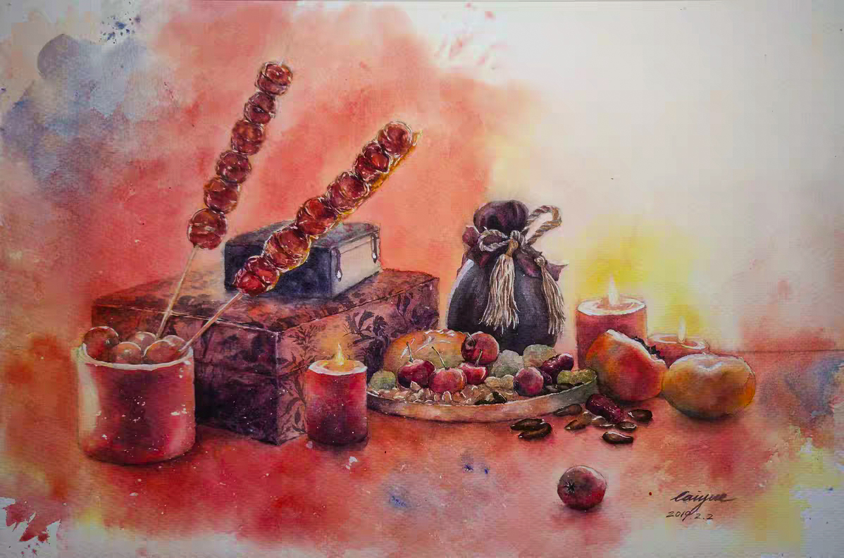
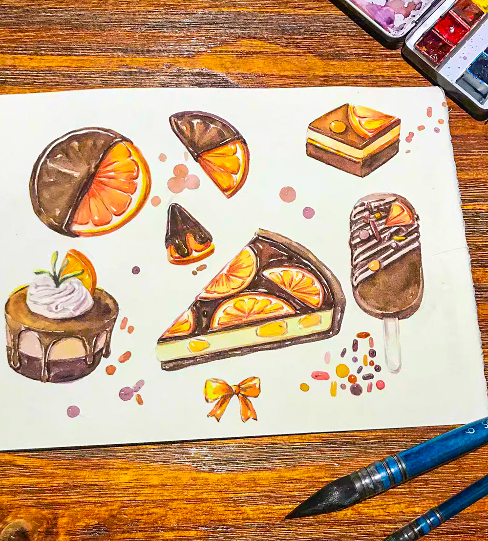
Today I bring you 31 food watercolor paintings, and the contrast and brightness of colors.
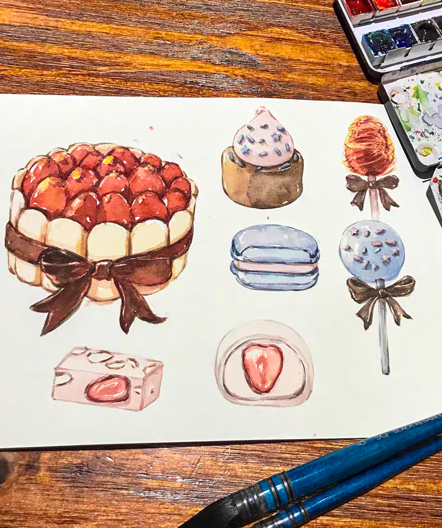
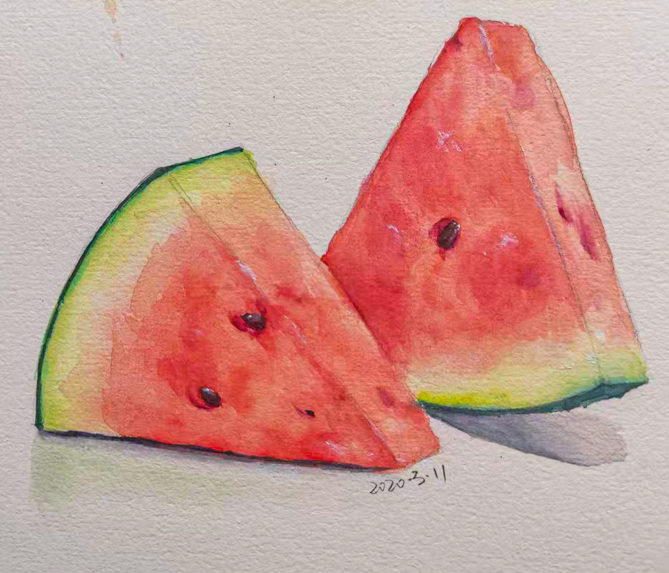
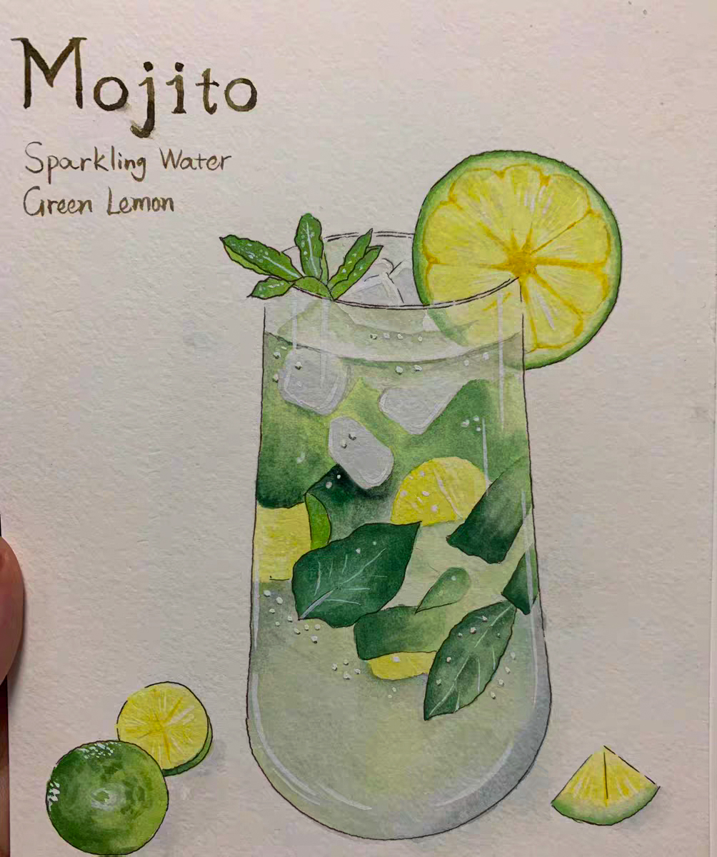
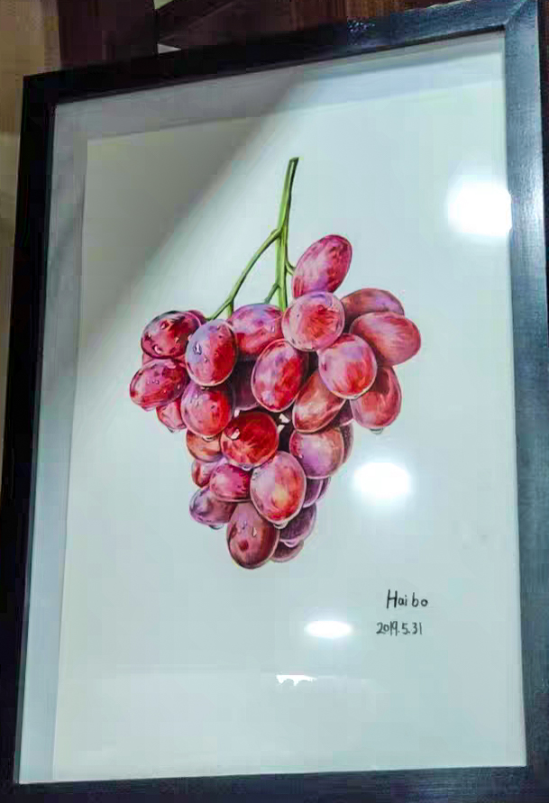
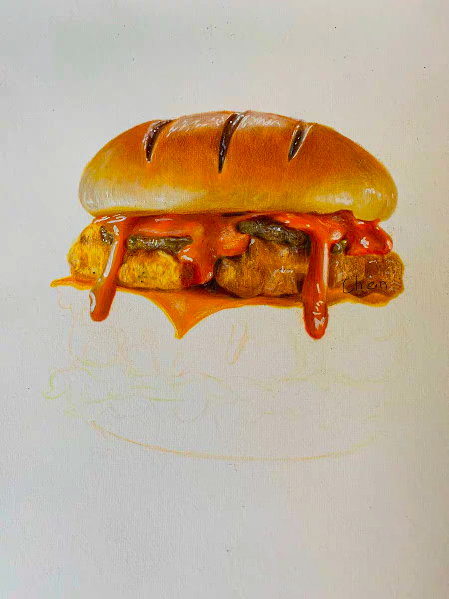
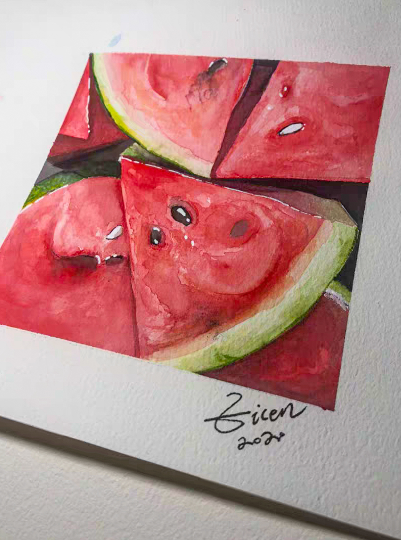
To reflect the deliciousness of the food, you need to use colors with higher saturation, and the color choices, such as yellow, orange, flesh color, tender green, etc., are the main colors and hues in food. So we can see that in food watercolor painting, the main tones are based on bright colors with relatively high brightness and purity.
The following describes the contrast and brightness of colors. It is convenient for us to understand the color of food watercolor.
The simplest, most commonly used, and most natural color in color contrast. When the brightness changes, the color contrast will produce a lot of new changes, you can change yellow to red, blue, and so on. The difference in light, the change is endless. So the expressive power of hue is also infinite.
Color contrast is a frequently used contrast technique used by modern painters and designers. It has great expressive potential, and it can be expressed warmly and sadly. For example, the modern painters Matisse, Mondrian, Kandinsky, Miró. Their artworks use very bright color contrast, which makes their artworks more attractive.
Color contrast is applied in modern design. The color of the logo, the color of the banner, the color of the advertisement, the color of the clothing, and so on. Is widely used. In today's era, we no longer worry about eating, so people will pursue aesthetics even more. Different colors reflect the more autonomous and clear personality of modern people and reflect the richness of spiritual life.
2. Brightness contrast.
Day and night are natural phenomena of the earth. Black and white light is also common in human society. Therefore, each color has its own lightness characteristics. All visual phenomena are caused by color and brightness. The human eye has the ability to distinguish different brightness and color.
To reflect the deliciousness of the food, you need to use colors with higher saturation, and the color choices, such as yellow, orange, flesh color, tender green, etc., are the main colors and hues in food. So we can see that in food watercolor painting, the main tones are based on bright colors with relatively high brightness and purity.
1. Color contrast.
The simplest, most commonly used, and most natural color in color contrast. When the brightness changes, the color contrast will produce a lot of new changes, you can change yellow to red, blue, and so on. The difference in light, the change is endless. So the expressive power of hue is also infinite.
Color contrast is a frequently used contrast technique used by modern painters and designers. It has great expressive potential, and it can be expressed warmly and sadly. For example, the modern painters Matisse, Mondrian, Kandinsky, Miró. Their artworks use very bright color contrast, which makes their artworks more attractive.Color contrast is applied in modern design. The color of the logo, the color of the banner, the color of the advertisement, the color of the clothing, and so on. Is widely used. In today's era, we no longer worry about eating, so people will pursue aesthetics even more. Different colors reflect the more autonomous and clear personality of modern people and reflect the richness of spiritual life.
2. Brightness contrast.
Day and night are natural phenomena of the earth. Black and white light is also common in human society. Therefore, each color has its own lightness characteristics. All visual phenomena are caused by color and brightness. The human eye has the ability to distinguish different brightness and color.
To reflect the deliciousness of the food, you need to use colors with higher saturation, and the color choices, such as yellow, orange, flesh color, tender green, etc., are the main colors and hues in food. So we can see that in food watercolor painting, the main tones are based on bright colors with relatively high brightness and purity.
The following describes the contrast and brightness of colors. It is convenient for us to understand the color of food watercolor.
To reflect the deliciousness of the food, you need to use colors with higher saturation, and the color choices, such as yellow, orange, flesh color, tender green, etc., are the main colors and hues in food. So we can see that in food watercolor painting, the main tones are based on bright colors with relatively high brightness and purity.
To reflect the deliciousness of the food, you need to use colors with higher saturation, and the color choices, such as yellow, orange, flesh color, tender green, etc., are the main colors and hues in food. So we can see that in food watercolor painting, the main tones are based on bright colors with relatively high brightness and purity.To reflect the deliciousness of the food, you need to use colors with higher saturation, and the color choices, such as yellow, orange, flesh color, tender green, etc., are the main colors and hues in food. So we can see that in food watercolor painting, the main tones are based on bright colors with relatively high brightness and purity.
To reflect the deliciousness of the food, you need to use colors with higher saturation, and the color choices, such as yellow, orange, flesh color, tender green, etc., are the main colors and hues in food. So we can see that in food watercolor painting, the main tones are based on bright colors with relatively high brightness and purity.
To reflect the deliciousness of the food, you need to use colors with higher saturation, and the color choices, such as yellow, orange, flesh color, tender green, etc., are the main colors and hues in food. So we can see that in food watercolor painting, the main tones are based on bright colors with relatively high brightness and purity.
To reflect the deliciousness of the food, you need to use colors with higher saturation, and the color choices, such as yellow, orange, flesh color, tender green, etc., are the main colors and hues in food. So we can see that in food watercolor painting, the main tones are based on bright colors with relatively high brightness and purity.
To reflect the deliciousness of the food, you need to use colors with higher saturation, and the color choices, such as yellow, orange, flesh color, tender green, etc., are the main colors and hues in food. So we can see that in food watercolor painting, the main tones are based on bright colors with relatively high brightness and purity. To reflect the deliciousness of the food, you need to use colors with higher saturation, and the color choices, such as yellow, orange, flesh color, tender green, etc., are the main colors and hues in food. So we can see that in food watercolor painting, the main tones are based on bright colors with relatively high brightness and purity.
To reflect the deliciousness of the food, you need to use colors with higher saturation, and the color choices, such as yellow, orange, flesh color, tender green, etc., are the main colors and hues in food. So we can see that in food watercolor painting, the main tones are based on bright colors with relatively high brightness and purity.
To reflect the deliciousness of the food, you need to use colors with higher saturation, and the color choices, such as yellow, orange, flesh color, tender green, etc., are the main colors and hues in food. So we can see that in food watercolor painting, the main tones are based on bright colors with relatively high brightness and purity.
To reflect the deliciousness of the food, you need to use colors with higher saturation, and the color choices, such as yellow, orange, flesh color, tender green, etc., are the main colors and hues in food. So we can see that in food watercolor painting, the main tones are based on bright colors with relatively high brightness and purity.
To reflect the deliciousness of the food, you need to use colors with higher saturation, and the color choices, such as yellow, orange, flesh color, tender green, etc., are the main colors and hues in food. So we can see that in food watercolor painting, the main tones are based on bright colors with relatively high brightness and purity.
To reflect the deliciousness of the food, you need to use colors with higher saturation, and the color choices, such as yellow, orange, flesh color, tender green, etc., are the main colors and hues in food. So we can see that in food watercolor painting, the main tones are based on bright colors with relatively high brightness and purity.
To reflect the deliciousness of the food, you need to use colors with higher saturation, and the color choices, such as yellow, orange, flesh color, tender green, etc., are the main colors and hues in food. So we can see that in food watercolor painting, the main tones are based on bright colors with relatively high brightness and purity.
Well, today's watercolor comparison, the introduction of brightness comparison is here, if you like a watercolor painting, then please practice more. In the process of painting, it is also a good way to find yourself. You can also sell your watercolors on online stores, Amazon, EABY, or ETSY.












0 Comments